Remember all those hours you spent at the mall just hanging out, not buying a thing? Well, a lot of us just never grew up. We just moved our hangout from the local mall to the Internet. We meet our friends online, we order food online, and we window-shop online. It’s a good life.
That is, it’s good unless you are at the receiving end of this online voyeurism. What do you do to make your visitor drop that teenybopper behavior — flitting from store to store, online, in this case — and instead, drop some real cash?
Many brands use remarketing display ads across the Web or on social media to keep themselves in their audience’s mind-space. A well-thought-out email marketing strategy helps you stay on would-be customers’ radars in an unobtrusive and inexpensive way.
Following are five crystal clear suggestions on going above and beyond push marketing and retargeting to get that elusive customer to stick.
1. Strike a Chord With Souvenirs
Giving away small branded tokens that can be used by your customers on a daily basis will work wonders for brand recall. Look beyond the usual cheap pens and caps as giveaways. With a little creativity, your giveaways can become the reason for users to keep coming back.
McDonald’s demonstrated this brilliantly with its Happy Meal toy giveaways. The toys were often in sets of four or five different variants every month, making kids want to collect them all. Over the years, they have become one of the reasons kids prefer a McDonald’s burger over rival brands.
You don’t need to be McDonald’s. Cheap freebies such as baseball cards or even a part of your product, such as customized bottle crowns, can become collectors’ items.
OK, so giveaways don’t do justice to how you brand your product or service — luxury goods, anyone? — but who says giveaways need to be tangible?
Companies that have a strong content strategy can offer something people will have a harder time losing, such as a digital download — or, you can go where your users always are. Social media.
The single most common reason for a user to follow a brand on social media, according to IBM, is to access discounts and freebies.
Contrary to what many leading social media marketers believe, plain old greed and the desire to save every possible penny win followers on social media. People love a free lunch any day — from coupons to complimentary product samples. Surprise, surprise!
What people claim to want just as much is the right to exclusive information about your brand that they can use to their advantage. Things like prior notification of an upcoming clearance sale, or the right to preview and shop in annual sales before they become open to the general public, are great incentives for the average social networker.
Take advantage of this fundamental instinct to keep your followers coming back frequently to your social business pages, and to drive eyeballs to your site or footsteps to your stores.
2. If You Have It, Flaunt It
One for your website: Don’t make users search for your search bar. The whole idea of “search” is to make life easier for your users and enable them to get exactly what they have in mind a tad quicker. If your site design or layout makes the search functionality hard to find, you’re defeating the entire purpose of the on-site user experience.
Amazon puts its large search bar top and center on its home page, making it utterly unmissable. The contrasting colors on the search bar make it stand out from the background even more.
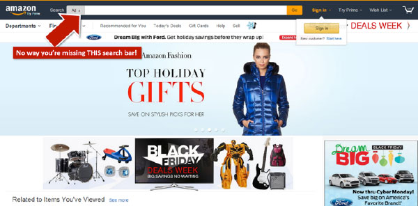
However, there are subtler but equally effective ways to position your search bar.
Crate & Barrel manages to have a large enough, yet less-overpowering search bar that anyone can find in a jiffy.
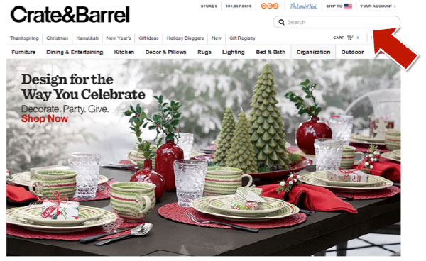
Besides on your home page, your on-site search bar should be accessible from every page on your site. This prevents users from getting lost and helps put time spent on your site to better use. Combine this with context-aware ecommerce search functionality, and you have an unbeatable merchandise showcasing ecosystem.
One notable exception that should not carry any search box, is your checkout section. This is obviously to avoid distracting your users and guiding them toward a quick conversion.
3. Allow Customers to Quickly Edit the Shopping Cart
In a real world store, you have the option of taking a pair of jeans to the dressing room, trying them on, and discarding them if you don’t like the way they look on you — no questions asked.
Online however, many companies expect users to stick to their choices and not be able to change their mind at the last minute once they have begun the checkout process. That is the kind of thinking that leads to millions of abandoned shopping carts.
Keep the Back button active in your checkout process and allow users to make modifications in their choices if they so desire. Even better, offer users the option of making modifications without going back, with simple dropdown menus for the usual suspects, such as size, number of items or color.
4. Send Churn Prevention Emails
Acquiring a new customer can cost anything from a few dollars to a few hundred, depending on your industry. Each time you acquire a new customer, the cost that’s been sunk into the effort needs to be recovered over a predetermined customer lifetime period. So what happens when a customer who needs to buy from you at least three times for you to break even suddenly stops transacting? You’re stuck with a net loss.
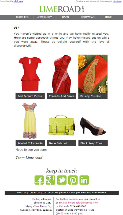
Enter churn-prevention emails. These are emails that address customers who are on the brink of extinction, if I may put it that way. They remind drifting users about all the cool stuff that your brand offers and any new things that happened while they were away. They give them a solid reason to come back and transact with you again.
That solid reason need not be a tailor-made freebie or a discount — that would just worsen your breaking-even problem. Instead, highlight your latest promotion in your email, and try to rekindle that human connection the way LimeRoad does it.
5. Go Far Beyond the Call of Duty
A satisfied customer is the result of any average e-commerce shopping experience. A delighted customer is born when you rise to the challenge and go above and beyond what is normally expected of you to make a customer happy.
This can be in the form of some outstanding customer service, a gesture that extends beyond the customer’s immediate purchase, or even a simple thank you note that accompanies your next shipment.
In January 2014, 7-year-old Charlotte Benjamin wrote an impassioned letter to Lego that complained about how the girl figurines in Lego sets did nothing but sit around at home or go shopping, while the boy figurines had fun at cool jobs or going on adventures.
Most companies would have ignored her letter and moved on with their lives. Not Lego.
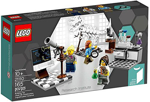
Two days after receiving this letter, Lego announced its intention of launching a science-oriented set highlighting female figurines. In a little more than six months after Charlotte sent her letter, Lego launched its Research Institute set.
The set took Charlotte’s words to heart. It is populated by an all-female crew — an astronomer, a chemist and a paleontologist.
How’s that for going beyond the call of duty?
Over to You
It doesn’t matter whether your target audience is eight or eighty. What matters is how your brand makes them feel.
That is what will keep them coming back. Don’t believe me? Ask your 4-year-old niece to part with her favorite Frozen figurine the next time you see her, and then we’ll talk.


